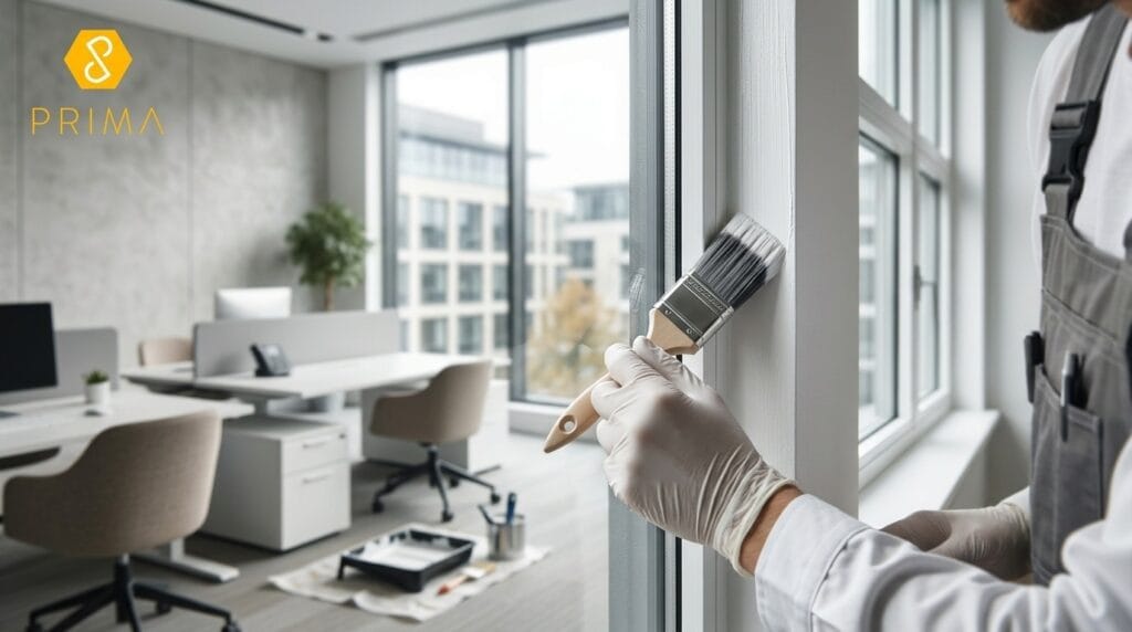
For the best part of a decade, the safe answer for any office repaint was some shade of grey. Neutral, inoffensive, easy to justify to a board. That’s shifting fast, and the businesses getting ahead of it aren’t doing it for aesthetics alone — there’s a genuine case that colour choice affects how staff focus, collaborate, and feel about coming into the office at all.
The biggest shift in commercial spaces this year isn’t one specific colour; it’s a move towards warmer neutrals and nature-inspired tones generally — clay, sand, sage, and terracotta replacing the cooler greys that dominated the past decade. The reasoning behind it is fairly consistent across the design world: hybrid working means staff are choosing to come into an office rather than being required to, and a space that feels considered and comfortable does more to earn that choice than a sterile, corporate palette ever did.
Green has become one of the most requested colours for meeting rooms and quiet zones this year, largely because of its association with nature and calm. It’s a practical choice for open-plan offices too, since a muted sage or olive tone can visually soften the harder lines of desks and partitions without making a space feel closed in. We’re fitting this most often in breakout areas and smaller meeting rooms, where the goal is to lower the visual noise of a busy floor rather than energise it.
Indigo and muted blue tones are showing up heavily in commercial colour palettes right now, largely on the strength of their association with focus and calm. A darker blue feature wall behind a bank of desks or in a dedicated quiet working area tends to visually settle a space in a way that pure white or grey doesn’t manage. It works particularly well combined with warm wood tones and natural light, rather than as a flat colour on its own across an entire floor.
Rather than full-room colour drenching, a lot of commercial spaces are using richer, warmer accents — terracotta, plum, and deep auburn tones — on a single feature wall or reception area rather than throughout the whole office. It’s an efficient way to signal a considered, updated space without the cost or disruption of repainting every room, and it tends to photograph well for a company’s own marketing and social presence too, which is a practical bonus most businesses don’t think about until after the work’s done.
Colour choice in a boardroom or reception area does more work than in a back office, since it’s the first thing a visiting client or candidate actually sees. A warm neutral or a considered accent tone signals a business that’s paying attention to detail, which matters more than most companies realise when a prospective client is deciding who to trust with a contract. It’s a subtle thing, but it’s exactly the kind of subtle thing that shapes a first impression before anyone’s said a word.
The risk with any trend-led colour scheme is applying it inconsistently across a large space, which ends up looking patchy rather than intentional. Proper commercial painting services should include a plan for how colour zones connect across meeting rooms, corridors and open-plan areas, not just a single accent wall chosen in isolation from the rest of the floor.
If your office is still working with a decade-old grey scheme and you want to bring it in line with where commercial design has actually moved, get in touch with Prima Decor for a proper site survey and a colour plan that works across your whole space, not just one wall.
FAQ Section
Warmer neutrals, sage and olive greens, muted indigo blues, and rich accent tones like terracotta and plum are replacing the flat grey palettes that dominated commercial spaces for the past decade.
There’s a reasonable body of evidence suggesting cooler tones like blue and green support focus and calm, while warmer neutrals create a more welcoming, comfortable environment. The effect varies by individual, but the broader trend is well established in commercial design.
Not necessarily. Many businesses are applying trend colours as accents in reception areas, boardrooms, or specific zones rather than repainting an entire floor, which is more cost-effective and still updates the overall feel of the space.
Cost depends on the size of the space, the number of rooms, and whether work is limited to accent areas or covers the whole floor. A proper site survey is the most reliable way to get an accurate, itemised quote.
Please select from below to see more:
Discover how we can help you with your decorating requirements. Call us on 020 8226 5125 or fill out our online request form and we will be in touch shortly.